During the past two weeks, I have been working on my final project with Python — a COVID-19 simulation. This post will outline wisdom and progress gained, as well as my plan for In-Depth Night, which is quite simple.
My plan for In-Depth Night.
The culmination of my Python journey has been the COVID-19 simulation, and thus it fits that it will be what I will be demonstrating at a table booth. The simulation is an excellent representation of my learning because everything I’ve learned is there; from classes and exceptions handling to the strategies Bill has taught me. For example, my mentor Bill taught me how I should structure and approach writing a program, how to find resources to learn about what I do not know, and the fact that I should not attempt to memorize concepts and instead focus on understanding them.
I applied such strategies and managed to learn matplotlib, tkinter, as well as the SIR model from scratch, using resources ranging from Python references and academic papers to video tutorials on Youtube. Regarding my “approach” to writing the program, I first created a plan (that I reviewed with Bill), listing many of the modules and methods I would use, and even created two separate files (for each class) as Bill had suggested. This overall development process that he had introduced to me ultimately made writing the program far easier and more fluid; I did not “drown” within the lines of code as I had previously when writing the two milestone projects.
How does this relate to In-Depth Night? Put simply, although none of this will be directly apparent/obvious to the audience, my progress and learning are ingrained everywhere and it is particularly evident to me. Simply comparing how I wrote the program (all described above) and the code itself to Python projects I had created before this year’s In-Depth allows one to see obvious differences and progress.
The audience will interact with my In-Depth by modifying the parameters/scenarios of the simulation. COVID-19 influences virtually every part of our lives, and it is quite imperative to understand how what we do can affect the outcome. Thus, the simulation is designed to be as informative as possible — in fact, Bill and I’s goal initially was to be able to draw conclusions about the pandemic from it. Naturally, accomplishing this goal makes it educative and worth the viewer’s time.
For example, different variables that the audience can interact with will include common terms we hear when referring to the pandemic, such as social distancing, vaccines, masking wearing, travel restrictions, and general public health guidelines. Ultimately, my goal is to make the simulation as user-friendly and as user-oriented as possible, similar to how professional programmers design applications and operating systems meant for users to interact with. This also involves making an aesthetically pleasing and intuitive user interface (more on making the simulation user-friendly next).
Apart from the program, I will also make my table booth eye-popping by creating a physical information board that has a heading that “advertises” my project.
Wisdom and progress!
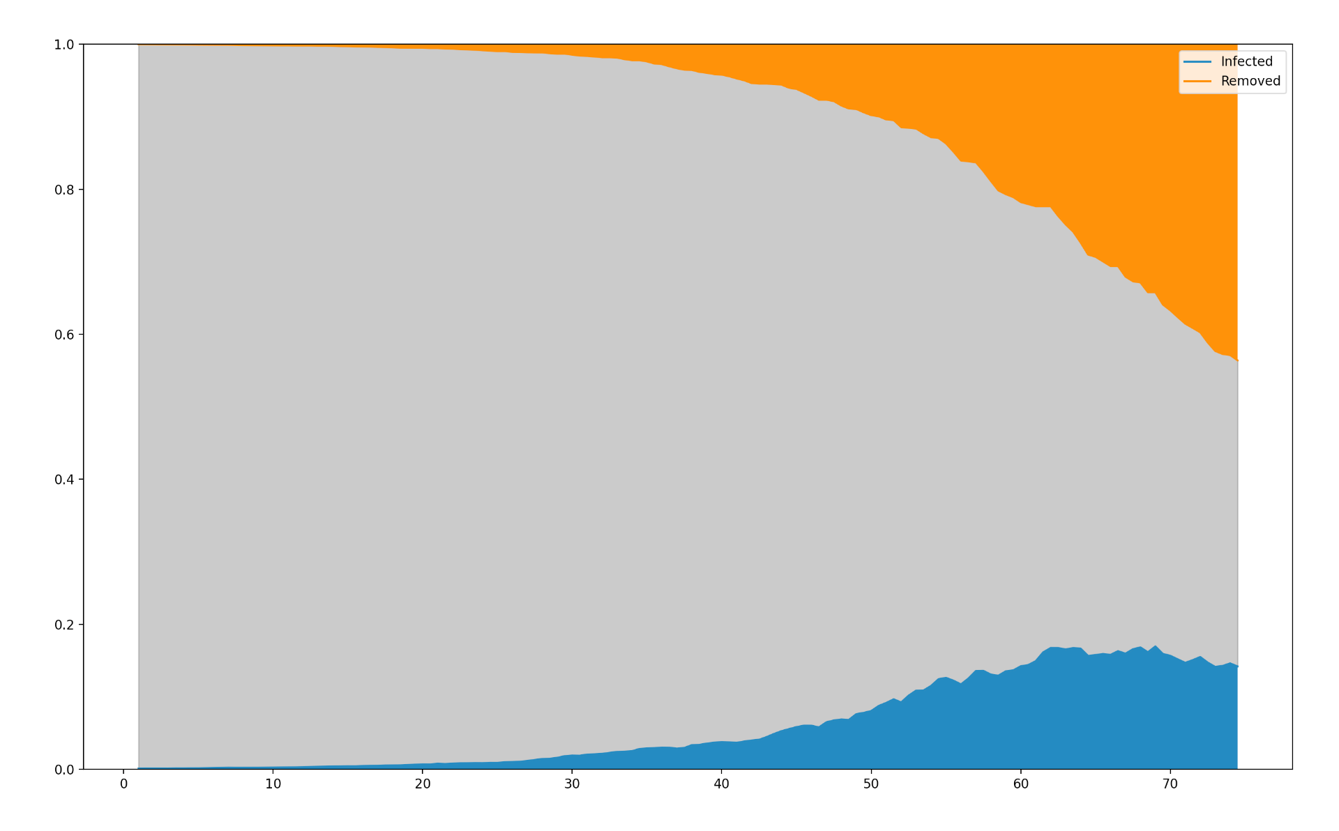
As for progress, I worked on the GUI (graphical user interface) and created a plot based on the SIR model. I separated the program into two parts, one for each class; the first plots an animated graph using the SIR model’s rates of change, while the second class creates a GUI that allows the user to set the variables.
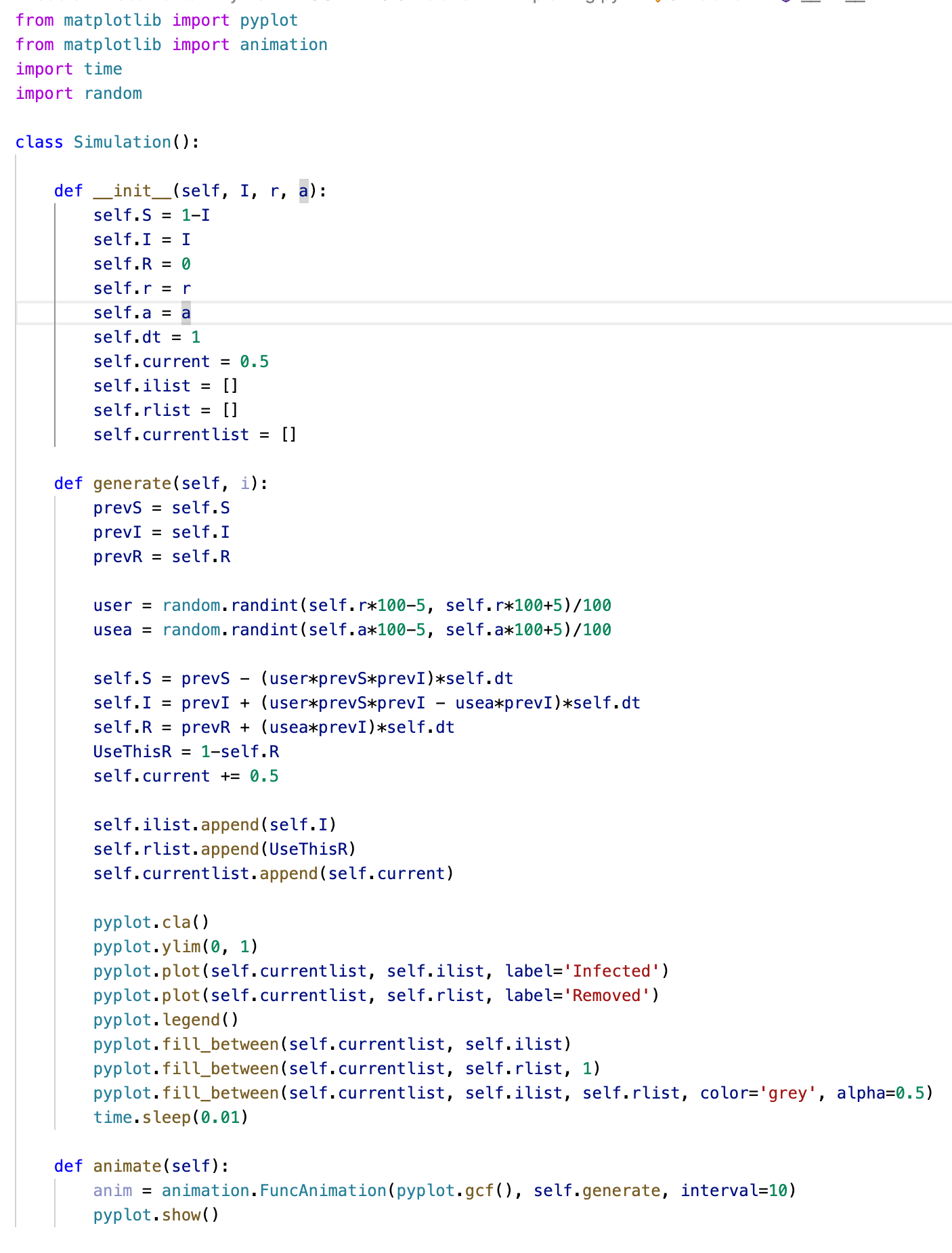
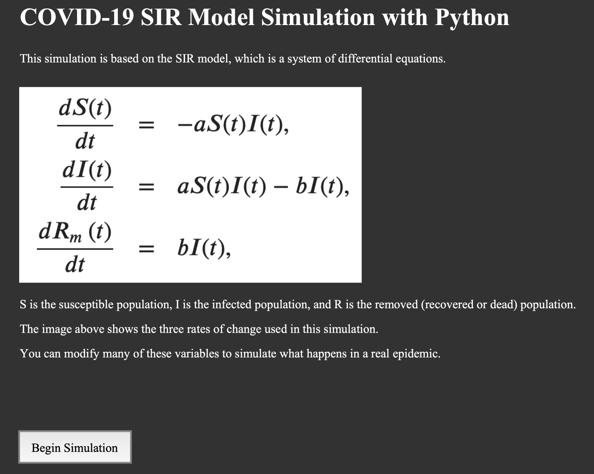
The Simulation class (see the image above) imports the matplotlib, time, as well as random modules. The init method sets up all the variables used in the SIR model, some of which can be modified by the user. The generate method applies the SIR model, and its output is plotted by the animate method using matplotlib’s FuncAnimation, which allows one to repeatedly call generate, producing SIR model values iteration-by-iteration. Note that nothing is called at the end of this program (everything is just defined).
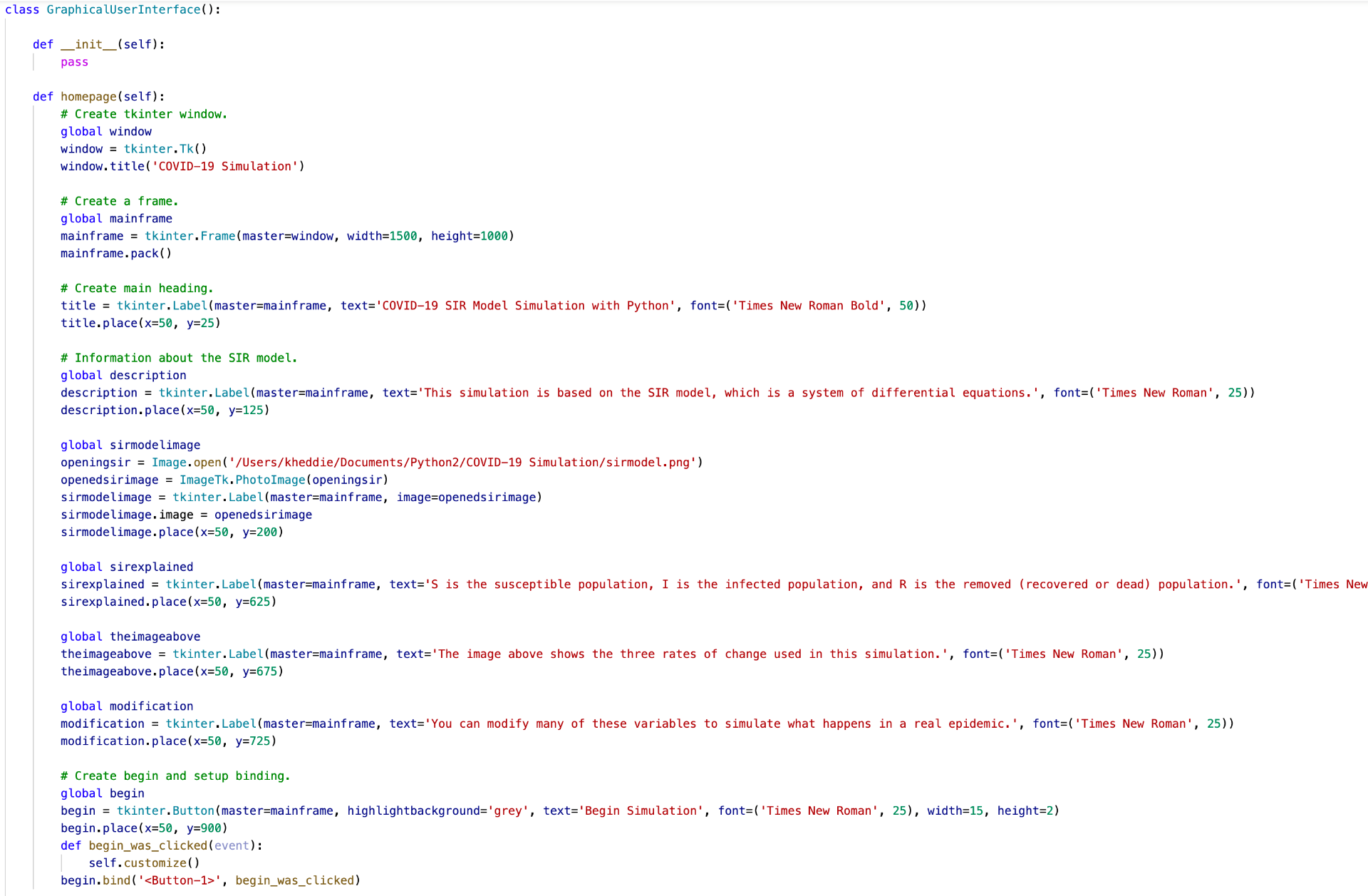
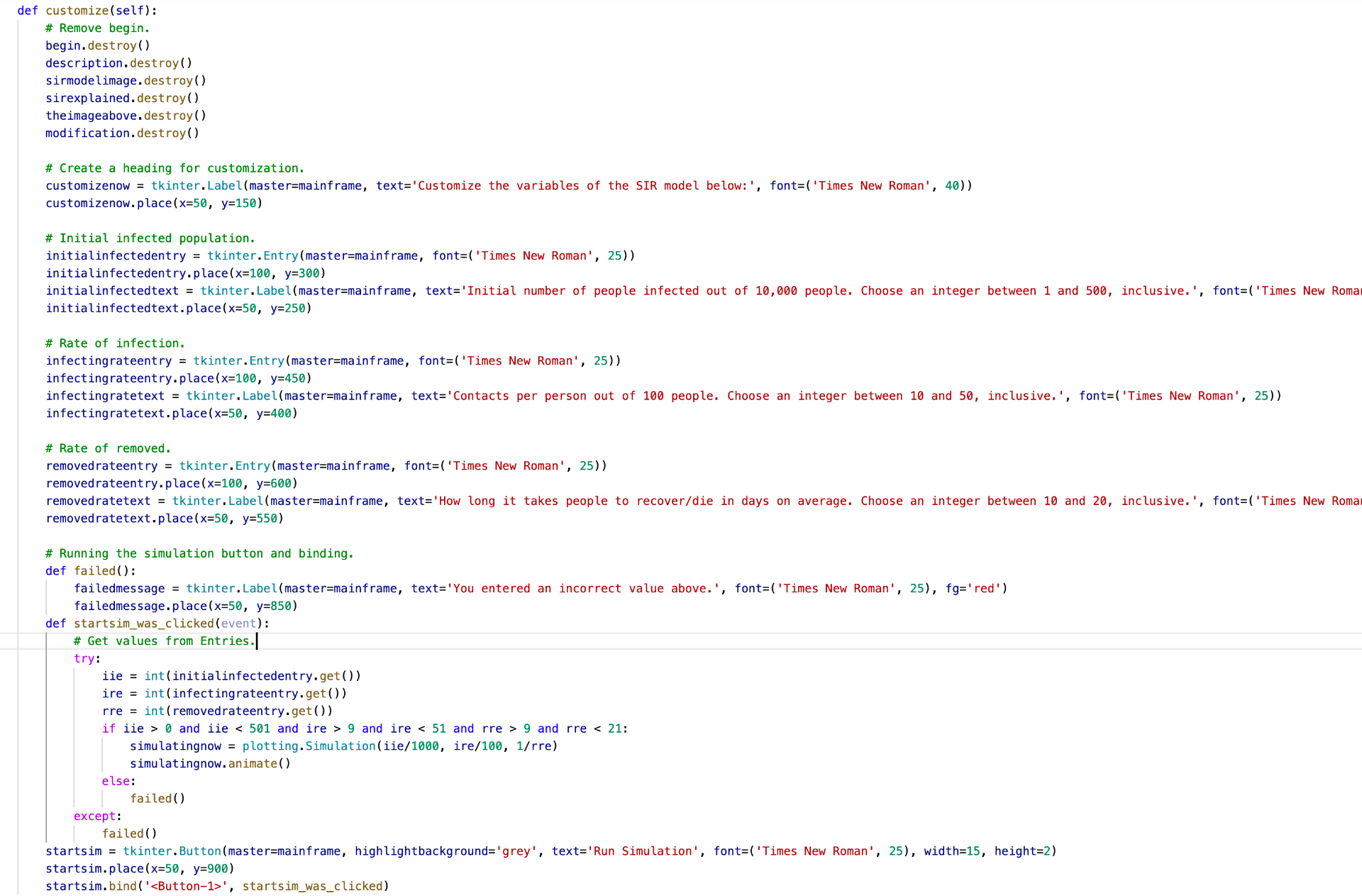
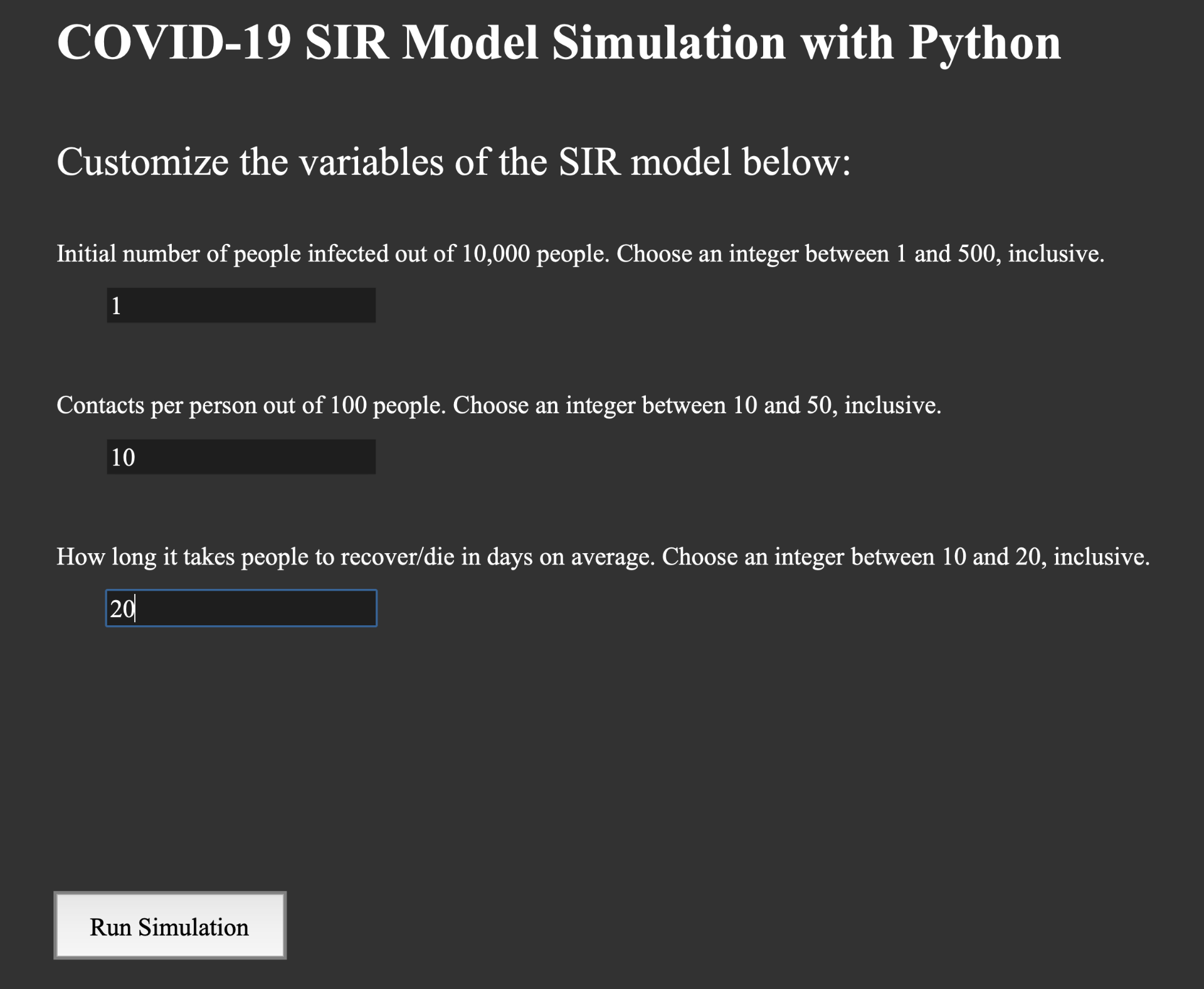
Why? The GraphicalUserInterface class imports tkinter, PIL (used to process images), and plotting, the latter of which is the class described above. The homepage method (see the image above) sets up the basic tkinter window, creating frames (where objects can be then placed inside) and using Label() and Button() to create the introductory message and “Begin Simulation” button. When the user clicks the button, it calls the next method, customize (see image below), which allows the user to modify the variables of the SIR model with Entry(). I also make sure the user’s inputted numbers are within a specified range, and when they click the button, the matplotlib simulation from the other program itself is called. Finally, tkinter uses mainloop() to handle all the events that occur, for example, the clicking of a button object.
Below are images of the GUI and simulation. The first two are the GUI produced by homepage and customize, respectively, while the bottom image is the plot. Blue is the number of infected, orange is the number of removed, while grey is the rest of the population that is still susceptible. Note, however, that this program is far from complete (illustrated next).
From Bill, I learned that whenever I implement the various aspects/features, I should always work towards improving the user experience. For example, Bill stated that the SIR model should be incorporated in such a way so that it is easily understandable and clearly applicable to COVID-19 in real life, which, as described, is the purpose of this program in the first place. This means doing the opposite of what my program prompts the user to do right now (in the screenshots above).
For example, when asking for user input (to modify the coefficients/rates of change, instead of simply asking, “What value would you like the infection rate to be?,” which no one knows how to translate into the pandemic real life, I should use terms such as social distancing, mask-wearing, number of contacts, etc. Another idea Bill and I came up with was to create various presets to represent common scenarios.
In turn, since this requires modifying the equations within the SIR model, Bill believes that the best way to do this is by looking at scientific papers on the topic and observing how they either set values for the rates of change (based on a certain aspect of COVID-19 in real life) or modify/add to the system of equations entirely (to incorporate more variables apart from simply the infection/removed rates).
Additionally, to improve the user experience, I also need to make the GUI more polished — currently, I believe that it is in its infancy and requires many improvements (obvious from looking at the images above). To accomplish this, I will base my GUI on commonly used applications such as Google Chrome and Microsoft Teams (or macOS/Windows).
That concludes this post! I would like to thank my mentor Bill once more — his help has been absolutely invaluable to me and I cannot imagine working on this project without his dedication and kindness!