Since my last blog post, the mentor that I had made plans with couldn’t fulfil all their necessary tasks that had to be completed to become my mentor. Sadly, we had to part ways which left me searching for a new mentor. Prior to the falling through with my previous mentor, I had a few discussions about this project with my father and I found out that he also enjoys photography too. I took advantage of this by making him my new mentor which I was told could only happen this year due to the pandemic. Since then, I’ve had a meeting with my father where we complemented and critiqued the best photos I have taken throughout the past few weeks.
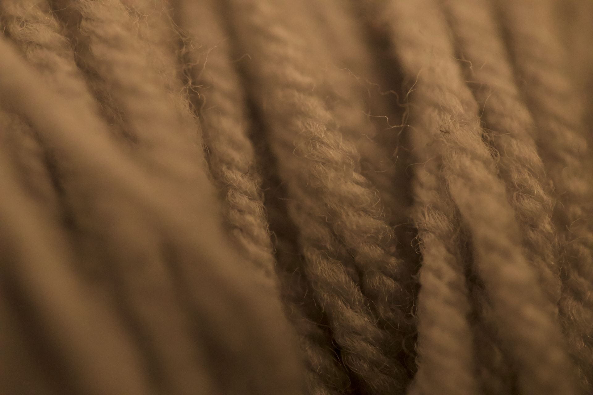
This past week I have been focusing more closely on capturing textures within everyday items around the house. While knitting, I noticed the yarn and its texture from the fibres that were fraying off the strands as well as the smaller fibres that are intertwined with one another. I thought that that could be a very detailed oriented image, so I took the photo.
While studying this image, I pointed out how I found that the image to be a bit too warm, but my father disagreed. He said that the image could portray a warm feeling while you’re knitting giving you a sense of comfort. I saw where he was coming from and I changed my view and agreed with him. In addition, my father taught me about the thirds rule in photography, how the eyes flow to the intersections of those lines. As a result, we noticed that the prominent foreground element in the bottom left was too obstructive and distracting to the viewer because it took up so much of the space, so you’re left wondering what that is. This led me to the realization of how often I make the foreground elements jump out of the frame almost to a fault.

We started the discussion on this image by introducing how the different angles of yarn strands affect the overall experience of the image and how your eyes follow those angles. My father pointed out how the two raised portions of yarn on either side of the focal point really frame the image as well. I stated that the less amount of frayed yarn in this image is much less distracting to the viewer than the much larger amount of frayed yarn that appeared in the first image. My father agreed with me on how the less frayed yarn was a positive thing, on the other hand, he disagreed with my idea of it being distracting. Instead, he suggested that it was a positive thing because it helped show the flow of the yarn along their angles.
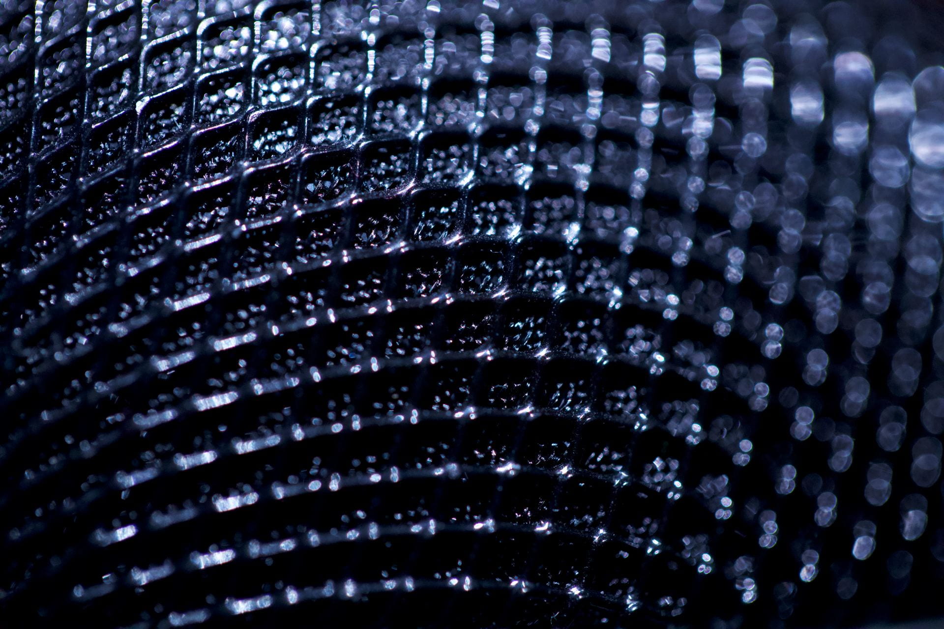
While we analyzed this image, I pointed out the nice bokeh that took shape in the top right image and my father agreed that it looked quite nice especially with the silver shimmer that appeared. Moreover, my father saw strong magenta tones coming from the centre of the image which I didn’t see right away. He thought that it contrasted well with the black and silver. Although I could see where his opinion was coming from, I had to differ mostly because the magenta tone usually means that there is an issue with the lens itself or the composition in some manner. I think that this is a more situational difference because of this specific photo.
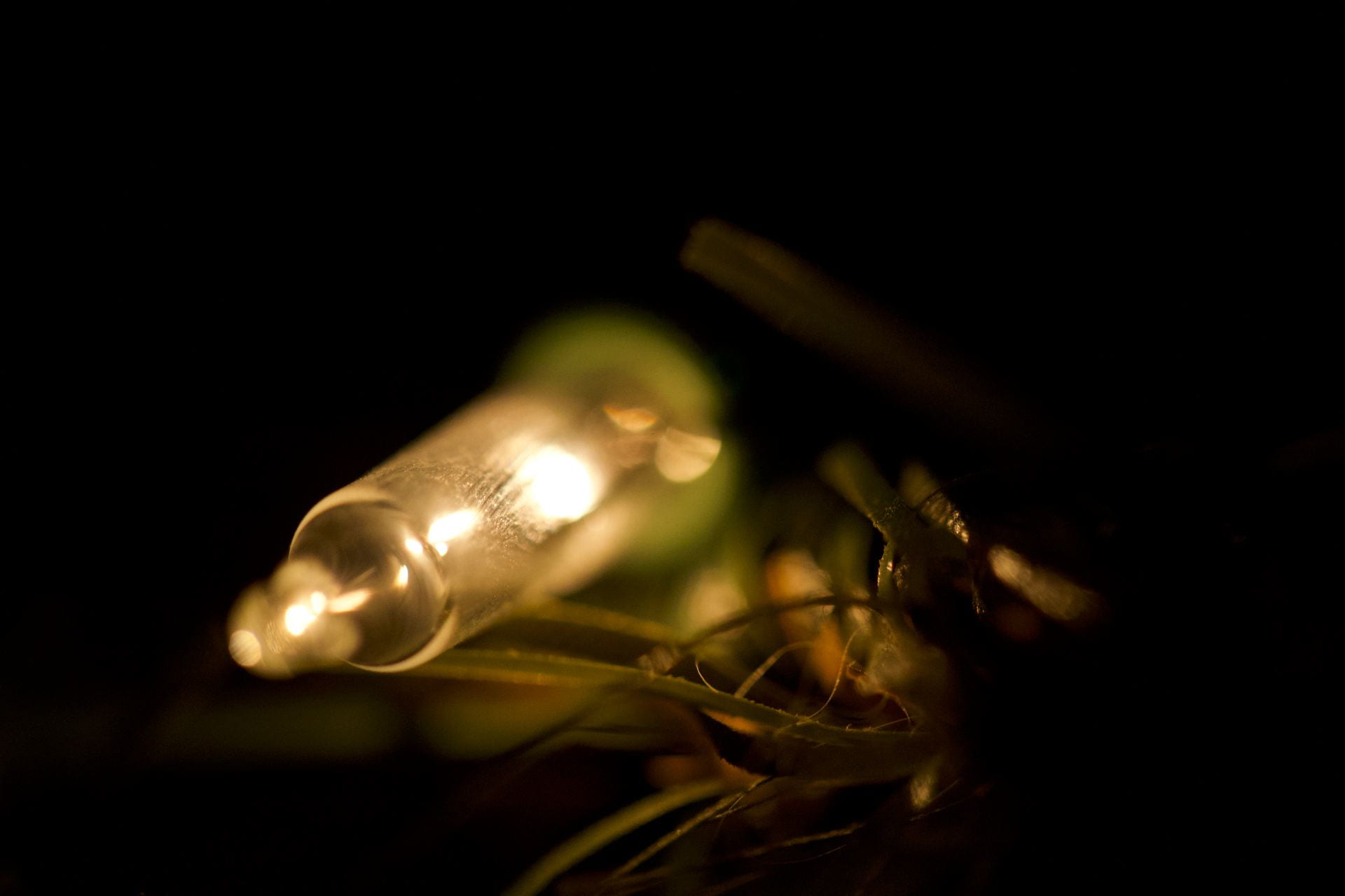
While analyzing this image, there weren’t as many critiques as possible to discuss compared to some of the other photos. My father and I both agreed that the framing looked good, however, we disagreed on the lighting choices. I thought that raising the light in the background could be a nice addition, whereas my father suggested to leave it because he thought it looked good as is. Although we did disagree with each other, we found common ground when critiquing the placement of the focal point of the image was. We both found it odd as to why I would focus the image on the centre of the light rather than the tip or the base. Moreover, the focus on the centre of the light made it so the artificial garland was more in focus as well, which was not the goal.

When taking this photo, I got especially inspired to capture it because from a perspective further away, it just looks like a plain white dog toy. However, when you get up close to the toy, all the sudden you begin to see all these different colours leap towards you.
When my father and I began studying this image, the subject of colour was brought up a lot. We both agreed that the extra boost of colour was quite refreshing especially since there are so many different colour profiles involved with this image. In addition, we agreed that the image was a bit too cold meaning that the kelvin scale was lower than it should have been. Moreover, my dad especially enjoyed how most of the image is in focus this time, which is much better than having it be such a large range. Furthermore, the foreground element of the toy was way less obtrusive in this image which I think made it less distracting.
In conclusion, I have made some great advancements in macro photography over the past few weeks that I’m proud of and I can’t wait to further my progression over the rest of the project. I believe that from the interview that I had with my mentor, I have come to realize a lot of my photography is based on instinct rather than expertise so I will try to become more specific with every image I take. Moreover, throughout the next few weeks, my mentor has tasked me with getting outdoors and taking pictures of the morning frost that appears on certain leaves and other plants. I am going to take this opportunity because there is supposed to be another colder patch of weather coming in over the next few weeks and I am unsure if that weather will return more often in the future of this project.