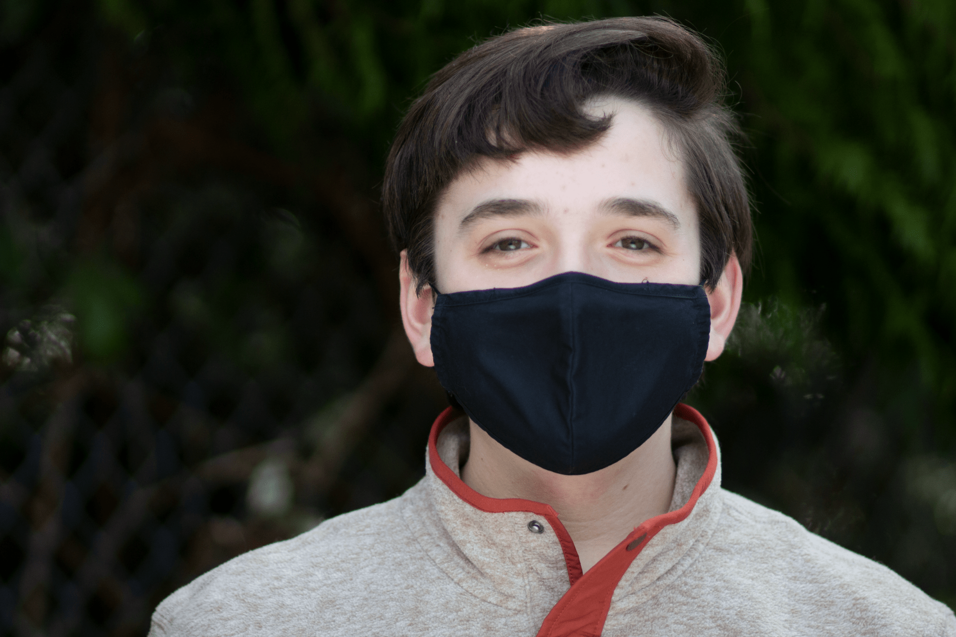
This is the portrait photo with the reflector. You can sort of tell that his face is brighter letting you see the details a little better and you can tell the photo has more contrast to the background.
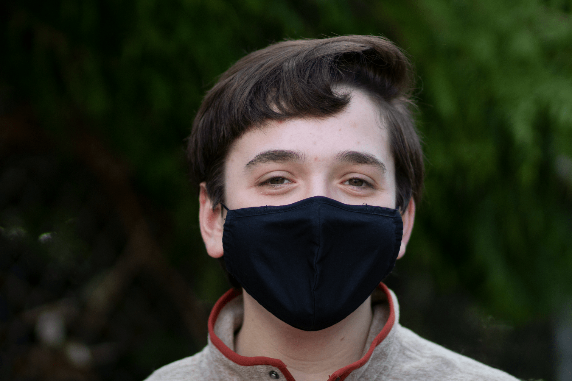
This is the portrait photo without the reflector. I think that it looks pretty good despite the less bright setting. You can kind of tell that there are a bit of shadows around his mask with this one.
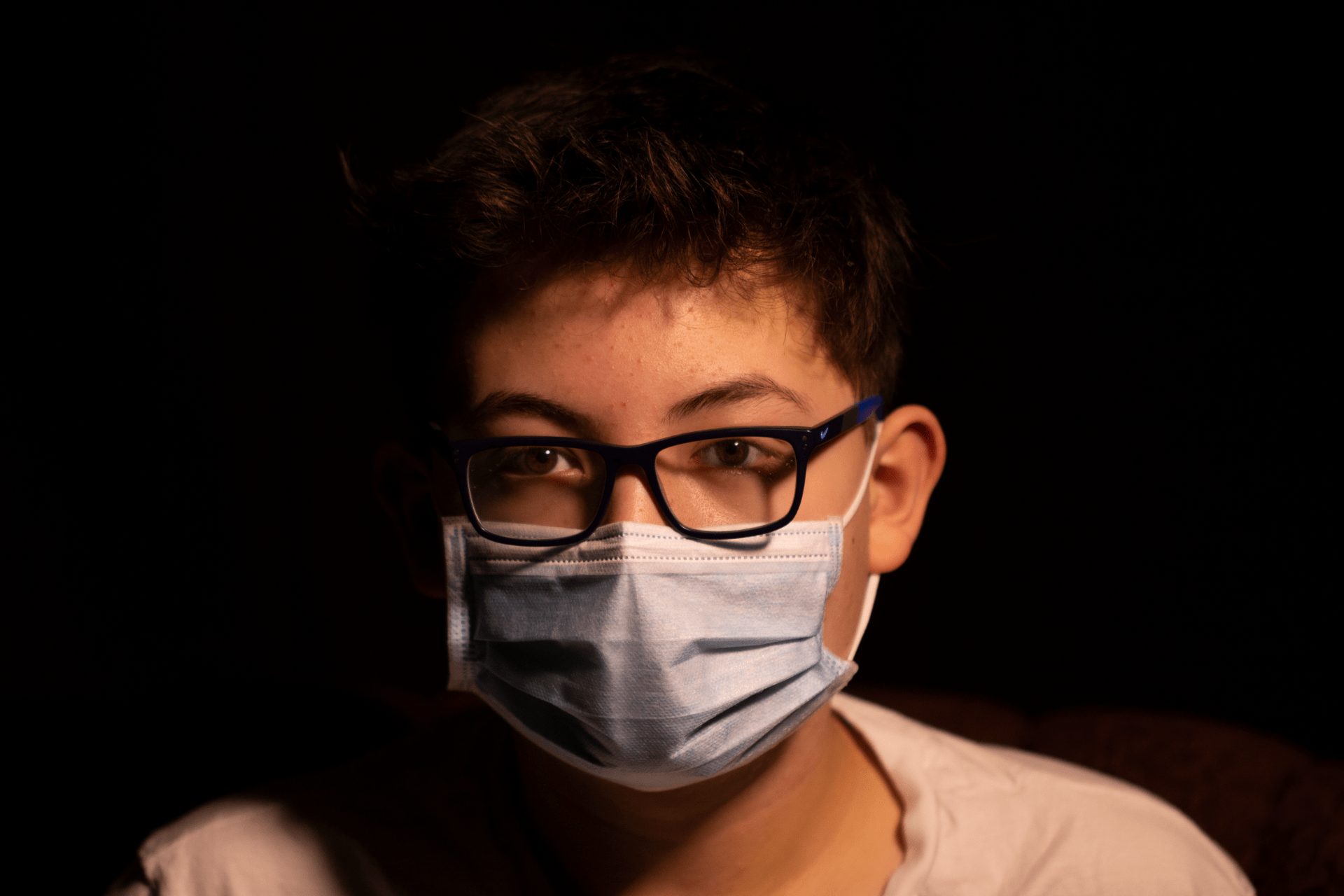
This is my photo with just the key light. You can tell that there are a lot of shadows and since the background is black, his face starts to blend in with the background.

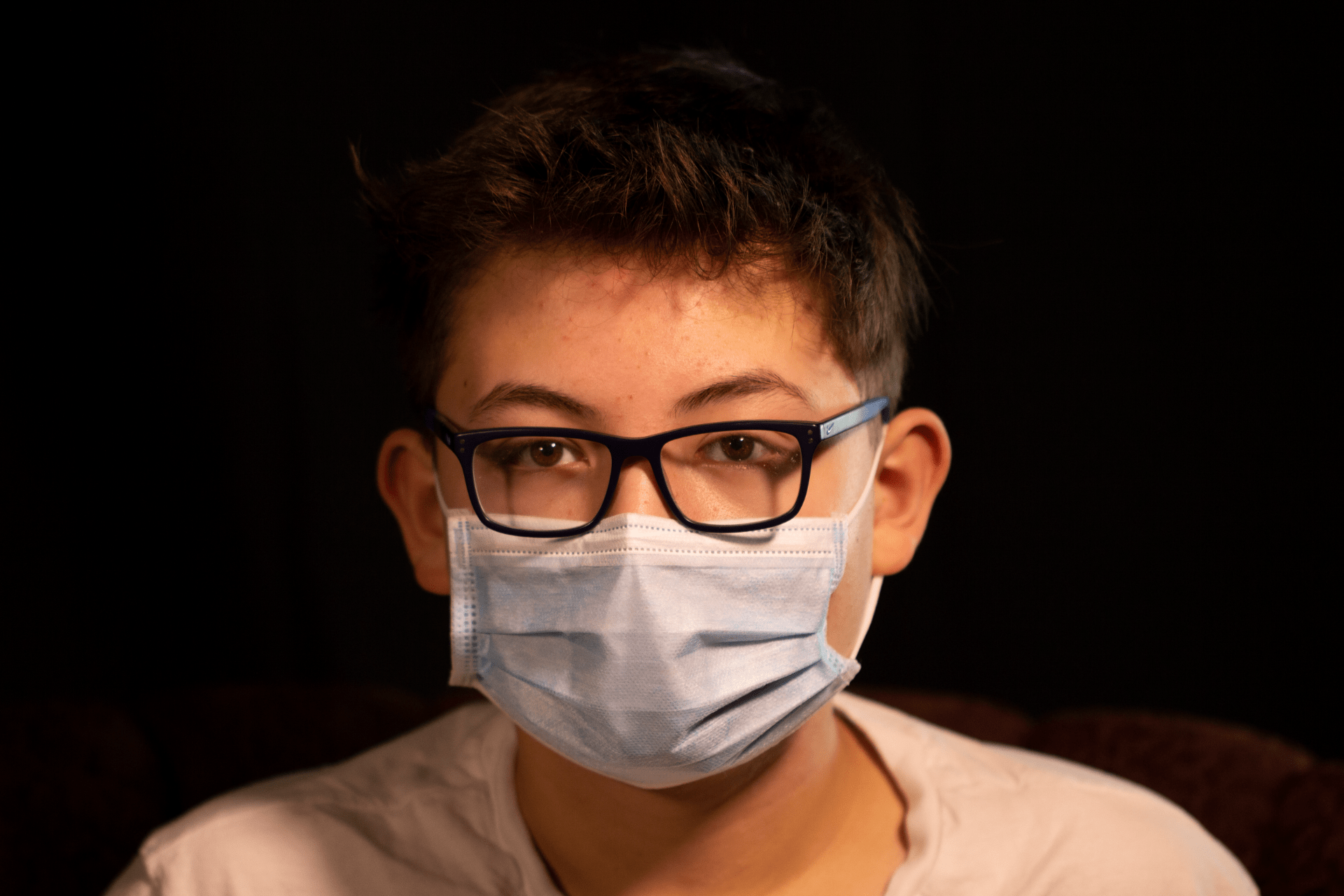
This is the photo with the key light and fill light. Compared to the last photo, it looks a lot better. You can see his face better, and the colours are more vibrant.
This is the photo with all the lights. I might have positioned the third light wrong, as one side is almost too bright. It is very similar to the 2nd photo and the main difference is that it gives the photo some overall exposure.