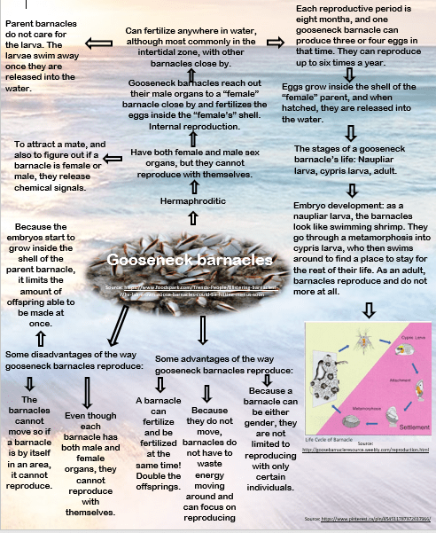
Summary of the assignment and learning objectives:
For this project, we were each assigned one organism that we had to research. There was a list of criteria and questions we had to answer about our organism, such as ‘how do they reproduce?’ and ‘what are the advantages and disadvantages of the way your organism reproduces?’. We then had to show our research in a clear and concise way. I was assigned the gooseneck barnacle. I researched and answered all the questions and presented my research using an infographic that resembles a flow chart and a mind map.
Criteria:
I design my work with consideration given to aesthetics and design, such as consistent colour schemes, symmetry or organization of visual elements, and overall layout (7)
We were not given a specific way to present our research, just that it had to be clear and easy to read. I decided to do a combination of a flow chart and mind map. This layout was easy to read and clearly showed how each point connected to other points. I put in a lot of effort to make the infographic aesthetic, using bright colours and a format that was easy to follow. I also used visual elements that were engaging and helped the audience understand the information in the infographic, such as diagrams and pictures of the barnacles. I tried to make the infographic as easy to follow and organized as possible so that the audience could easily learn more about gooseneck barnacles.
I determine and use the most effective medium to present my work (6)
As the presentation of our information for this project was up to us to decide, I had to find a way to show my research in a way that was clear and concise. I thought of many different options for how I could show my research, and in the end, I decided that a combination of a mind map and a flow chart would be the most effective. The flow chart/mind map showed how ideas and information were connected, which made understanding and reading the research more interesting and easier to understand.
I tailor my work to appeal to my intended audience and use language and visual design elements appropriate for them (2)
While creating the infographic, I had to decide what visuals to include, knowing that my intended audience was the rest of my class. I wanted to make the infographic interesting to look at with bright colours so that people would be interested, and I also wanted to use visuals that would enhance their understanding. When choosing the language, I used words that we had learned in class, such as embryo, and then I explained other words that were more specific to the barnacle to make sure people understood.
I enhance the impact of my research or presentation through creative use of technology (5)
By combining pictures, diagrams, text and in a format resembling a flow chart and a mind map, I creatively used technology to make my infographic more interesting to look at, concise, and easily understandable. By adding diagrams from the internet, I made it easier to understand the concepts on the infographic, and by using pictures and bright colours, I made the infographic more interesting to look at, which makes people more likely to read it. The use of shapes and format made it easy to follow and clearly shows my research and answers to the questions.